Uncovered Books: A new direction for the publishing world

When was the last time you thought to yourself, "I need a new book... like, one that's kind of like [insert book here] but a little more exciting, and maybe like a cross between that book and [insert second book]..." If you're like me, pretty often.
But the options tend to be that you go to Amazon and search for books based on the broad categories they offer, or ask your friends who may or may not read the same kinds of books you read, or maybe an online forum, or even head to a bookstore and see if you can find something on the shelves. Regardless of which of those you try, you're looking for something specific in a pretty huge pile of possibilities. Not quite a needle in a haystack, but maybe a button in a pile of laundry :)
Enter: Get Uncovered Books
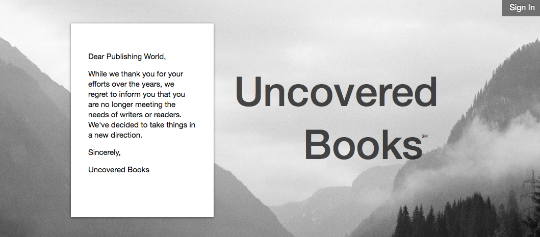
Here's the letter they drop on their home page:
Dear Publishing World,
While we thank you for your efforts over the years, we regret to inform you that you are no longer meeting the needs of writers or readers. We've decided to take things in a new direction.
Sincerely, Uncovered Books
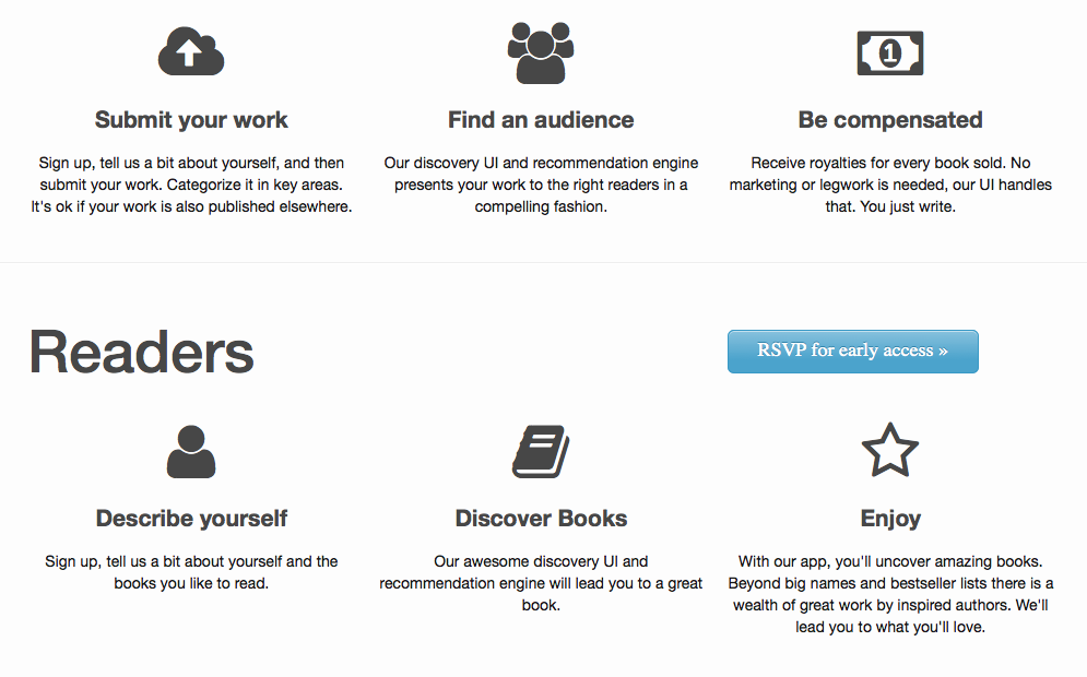
Pretty irreverent, which is fine with me. They promise two basic services. One for authors, one for readers:
1. For Authors: Submit your work, find an audience and be fairly compensated for your book. Sounds great.
2. For Readers: Register, describe yourself and Discover Books. That's the part that makes the big promise that sets Get Uncovered Books apart for me. Here is how they pitch the step: "Our awesome discovery UI and recommendation engine will lead you to a great book."
They are saying that they've got an algorithm that will take your interests, etc. and spit back books you will love. That's a personalized recommendation engine. If it works well, that's amazing.
The thing that also strikes me, beyond the promise of better book discoverability, is that the landing page looks very well designed. In fact, it looks beautiful. Look at this:

I bring this up because most of the pages I visit that are creating new publishing or book-related website seem crowded with features, or at least have more words than necessary on the page. They're slapped together and built onto over the years. And that's generally fine. I'm a word person, and I'm more concerned with what I get out of my time on the site than how it looks. But I have to say, when I do see one that's well designed, it makes me want to spend time there and use it. I'm being picky, of course, which comes with years of talking about websites with my wife, who is a talented UX designer.
But Get Uncovered Books has a promise I'm excited to see. They say it's "Blooming in Spring on iPad & iPhone," so hopefully we can ride those petals into the future of book discoverability soon.
If you want to see what that bloom looks like, you can sign up on their site for early access.
Image courtesy of Screenshot via GetUncoveredBooks.com

2 comments